Unlocking AI recommandations with the redesigned homepage

Unlocking AI recommandations with the redesigned homepage

Unlocking AI recommandations with the redesigned homepage

A mobile-first homepage redesign for a skills intelligence platform, following the acquisition of Flashbrand and the onboarding of LVMH as a key enterprise client.

A mobile-first homepage redesign for a skills intelligence platform, following the acquisition of Flashbrand and the onboarding of LVMH as a key enterprise client.

A mobile-first homepage redesign for a skills intelligence platform, following the acquisition of Flashbrand and the onboarding of LVMH as a key enterprise client.

Mobile screens mockup showing the new homepage of the Talent Marketplace

Client:

LVMH via Neobrain

My Role & Team:

2 Engineers (Back & Front) · 1 Product Designer (Myself)

Year & Duration:

2024 · 12 weeks end-to-end

Scope:

UX Research · Product Strategy · UI Design

01 CONTEXT

An acquisition that required merging two products into one coherent experience

An acquisition that required merging two products into one coherent experience

Neobrain, an AI-powered Talent Management SaaS platform, acquired the American company Flashbrand to accelerate its expansion into the US market. The acquisition brought a strategic challenge: Flashbrand and Neobrain had two fundamentally different product architectures. Flashbrand was a native mobile app, while Neobrain was a responsive SaaS product. The decision was made to build on Neobrain's SaaS infrastructure. In an enterprise context like LVMH, with thousands of employees across multiple regions, deploying a native app at scale would have required IT approval processes, device management policies, and dual-platform maintenance for iOS and Android. The responsive SaaS approach removed those deployment barriers entirely, while retaining full mobile accessibility.

Neobrain, an AI-powered Talent Management SaaS platform, acquired the American company Flashbrand to accelerate its expansion into the US market. The acquisition brought a strategic challenge: Flashbrand and Neobrain had two fundamentally different product architectures. Flashbrand was a native mobile app, while Neobrain was a responsive SaaS product. The decision was made to build on Neobrain's SaaS infrastructure. In an enterprise context like LVMH, with thousands of employees across multiple regions, deploying a native app at scale would have required IT approval processes, device management policies, and dual-platform maintenance for iOS and Android. The responsive SaaS approach removed those deployment barriers entirely, while retaining full mobile accessibility.

Neobrain's product serves three distinct user personas — employees, managers, and HR teams. This project focused exclusively on the employee homepage. Neobrain's value proposition is built on a fundamental dependency: the richer an employee's profile (skills, experiences, and aspirations) the more precise the AI-driven recommendations become. Without it, the platform cannot deliver personalised career paths, learning suggestions, or mobility opportunities.

Neobrain's product serves three distinct user personas — employees, managers, and HR teams. This project focused exclusively on the employee homepage. Neobrain's value proposition is built on a fundamental dependency: the richer an employee's profile (skills, experiences, and aspirations) the more precise the AI-driven recommendations become. Without it, the platform cannot deliver personalised career paths, learning suggestions, or mobility opportunities.

A two screens from the hair salon website

02 PROBLEM

Low profile completion was breaking the platform's core promise

Low profile completion was breaking the platform's core promise

1. Drive profile completion —

1. Drive profile completion —

particularly around skills, the core data layer powering AI recommendations.

2. Communicate value clearly —

2. Communicate value clearly —

so employees understood what completing their profile would concretely unlock.

3. Reduce notification overload —

3. Reduce notification overload —

replacing a chaotic stream of nudges with a clear, prioritised action hierarchy.

"I don't see the point of completing my profile, I don't have the time."

The problem wasn't friction. It was perceived value. Users didn't understand what completing their profile would unlock for them personally.

The problem wasn't friction. It was perceived value. Users didn't understand what completing their profile would unlock for them personally.

"When I arrive on the dashboard, it looks empty — and yet I have ten notifications asking me to complete a check-in or an annual interview."

Too many nudges, no clear path. The result: paralysis, not action.

Too many nudges, no clear path. The result: paralysis, not action.

03 APPROACH & PROCESS

End-to-end: my Design Process

End-to-end: my Design Process

DISCOVER

User Research & Cross-functional Alignment

We conducted with the Lead Product Designer 11 qualitative interviews with LVMH and BPCE employees. The key finding: users had a value perception problem, not a friction problem — they didn't understand what completing their profile would unlock for them.

01

DESIGN

Ideation, Prototyping & Validation

I explored multiple nudge patterns (social proof, badges, progress bars, checklists) and landed on a completion gauge + contextual checklist combination — addressing both motivation and next action in a single component.

02

DELIVER

Engineering Sprint & Design QA

Throughout the 3-week engineering sprint, I worked closely with the frontend engineer — conducting design QA reviews at key milestones, adjusting specs in real time, and providing feedback on component rendering across breakpoints.

03
A mockup of a Macbook for the about us page of the hair salon website
A two screens of the home page of the website

04 - KEY DECISIONS

The decisions that shaped the outcome

The decisions that shaped the outcome

1. Choosing the completion nudge mechanism

1. Choosing the completion nudge mechanism

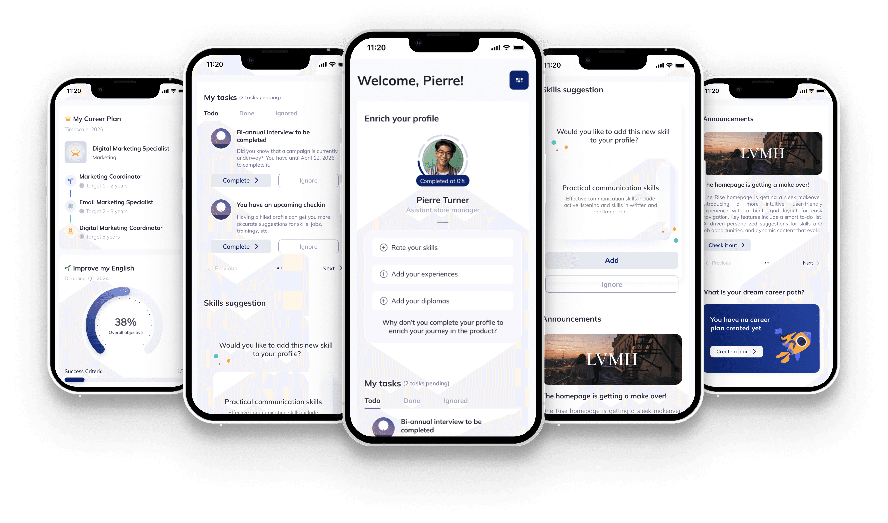
The research insight was that users didn't understand the value of completing their profile. A gauge alone answers "how much?" — a checklist answers "what specifically?" Together, they give users both the motivation (seeing progress) and the path (knowing the next step). Neither alone was sufficient.

Push notifications / banners — tested as too interruptive on mobile; users dismissed them

Push notifications / banners — tested as too interruptive on mobile; users dismissed them

Progress bar alone — showed how far along you were, but didn't tell you what to do next

Progress bar alone — showed how far along you were, but didn't tell you what to do next

Gamified badges — added engagement but felt misaligned with a professional enterprise context

Gamified badges — added engagement but felt misaligned with a professional enterprise context

Completion gauge + contextual checklist — gauge makes progress tangible; checklist makes the next action immediately clear

Completion gauge + contextual checklist — gauge makes progress tangible; checklist makes the next action immediately clear

2. Homepage structure — dashboard vs. action hub

2. Homepage structure — dashboard vs. action hub

The interviews were unambiguous: users didn't know where to start. The dashboard model would have given them more information with no clearer entry point. An action hub with a clear primary CTA (complete your profile) addressed the root cause — not the symptom — of low completion.

Dashboard approach — rich in data, but interviews showed users were paralysed by choice, not by lack of information

Dashboard approach — rich in data, but interviews showed users were paralysed by choice, not by lack of information

Action hub — profile completion as the primary hierarchy, platform features as secondary access points

Action hub — profile completion as the primary hierarchy, platform features as secondary access points

3. Reducing notifications to increase clarity

3. Reducing notifications to increase clarity

The interviews revealed a consistent pattern: the more notifications users saw, the less likely they were to act on any of them. The counter-intuitive solution was to show less — not more. By collapsing multiple competing nudges into a single, value-led completion flow, we gave users one clear reason to engage rather than ten unclear ones to ignore.

Reduce notification frequency via user settings — shifts the burden onto the user; doesn't fix the homepage experience itself

Replace the notification stream with a single prioritised action hub — one clear primary action (profile completion), secondary actions surfaced progressively

05 - RESULTS

Wins of the Revamp

Wins of the Revamp

PROFILE COMPLETION

PROFILE COMPLETION

from 17% to 56%

from 17% to 56%

of 500+ active profiles completed post-launch — a +39 point uplift, unlocking meaningful AI recommendation coverage for the first time

IN-APP SATISFACTION

IN-APP SATISFACTION

from 2.5 to 3.7/5

from 2.5 to 3.7/5

Homepage satisfaction score post-launch — a +48% improvement, reflecting clearer value communication and reduced cognitive overload

A screenshot from the Stuff page of the website