Building the Neo Design System from the ground up

Building the Neo Design System from the ground up

Building the Neo Design System from the ground up

A full design system built to unify two merged products, eliminate inconsistency, and give a cross-functional team a shared language between design and engineering.

A full design system built to unify two merged products, eliminate inconsistency, and give a cross-functional team a shared language between design and engineering.

A full design system built to unify two merged products, eliminate inconsistency, and give a cross-functional team a shared language between design and engineering.

A mockup of an iPhone placed on a chair's back

Client:

Neobrain

My Role & Team:

Design System Owner

Year & Duration:

2025 ยท 2 months

Scope:

UX Research ยท Design System

01 CONTEXT

An acquisition that made inconsistency impossible to ignore

An acquisition that made inconsistency impossible to ignore

When Neobrain acquired Flashbrand, the product team faced an immediate challenge: two products with two different visual languages, component libraries, and design conventions needed to become one.

When Neobrain acquired Flashbrand, the product team faced an immediate challenge: two products with two different visual languages, component libraries, and design conventions needed to become one.

A junior designer had laid some early groundwork in Figma, but the library was incomplete, undocumented, and inconsistent. I took full ownership of rebuilding it from scratch โ€” conducting an audit first, then systematically building a design system that could serve both the design team and the engineering team going forward.

A junior designer had laid some early groundwork in Figma, but the library was incomplete, undocumented, and inconsistent. I took full ownership of rebuilding it from scratch โ€” conducting an audit first, then systematically building a design system that could serve both the design team and the engineering team going forward.

Overview of the Design System components

02 PROBLEM

Two products, no shared language

Two products, no shared language

Before the Neo Design System, Neobrain's product had no single source of truth. The XD-to-Figma migration (in 2022) had left behind a partially migrated component base โ€” inconsistent between features, undocumented, and disconnected from what engineers were actually building in code.

The consequences were visible every sprint: designers working on different features were making different visual decisions for identical UI patterns. Every handoff required lengthy explanations. QA rounds went back and forth because what was built didn't match what was designed โ€” not because of negligence, but because there was no shared reference to align on.

The acquisition of Flashbrand made this urgent. Unifying two products with different design conventions โ€” without a system to anchor decisions โ€” would have produced a fragmented experience for LVMH's employees from day one.

The real cost

Every hour spent clarifying a button state, re-explaining spacing rules, or fixing a QA inconsistency was an hour not spent solving user problems. The design system wasn't a "nice to have" โ€” it was the foundation every other product decision was built on.

Every hour spent clarifying a button state, re-explaining spacing rules, or fixing a QA inconsistency was an hour not spent solving user problems. The design system wasn't a "nice to have" โ€” it was the foundation every other product decision was built on.

03 APPROACH & PROCESS

End-to-end: my Design Process

End-to-end: my Design Process

DISCOVER

Audit, Interviews & Inconsistency Analysis

I audited the existing Figma library and the live product, then interviewed designers and developers to map their pain points. The finding was consistent across both: no token architecture, no variant logic, no documentation. The scope of a full rebuild was clear from day one.

01

DESIGN

Architecture, Build & Documentation

I built the foundation first โ€” 58 color tokens, 33 typography styles, and a spacing system as Figma variables. Then 29 components with 400+ variants, each documented and reviewed with the frontend engineer for 1:1 Figma-to-Storybook alignment. WCAG AA compliance was embedded at component spec level, not retrofitted.

02

DELIVER

Storybook Alignment & Continuous Evolution

The DS launched in parallel with a fully documented Storybook library โ€” each Figma component mapped to its coded counterpart. The system is intentionally living: I maintain ownership, keeping documentation current and the Figma library as the single source of truth as the product evolves.

03
A mockup with 3 screens from jop portal app
The top half of a screen of a mobile device

04 - KEY DECISIONS

The Decisions That Shaped the Outcome

The Decisions That Shaped the Outcome

1. Rebuild from scratch vs. fix the existing library

1. Rebuild from scratch vs. fix the existing library

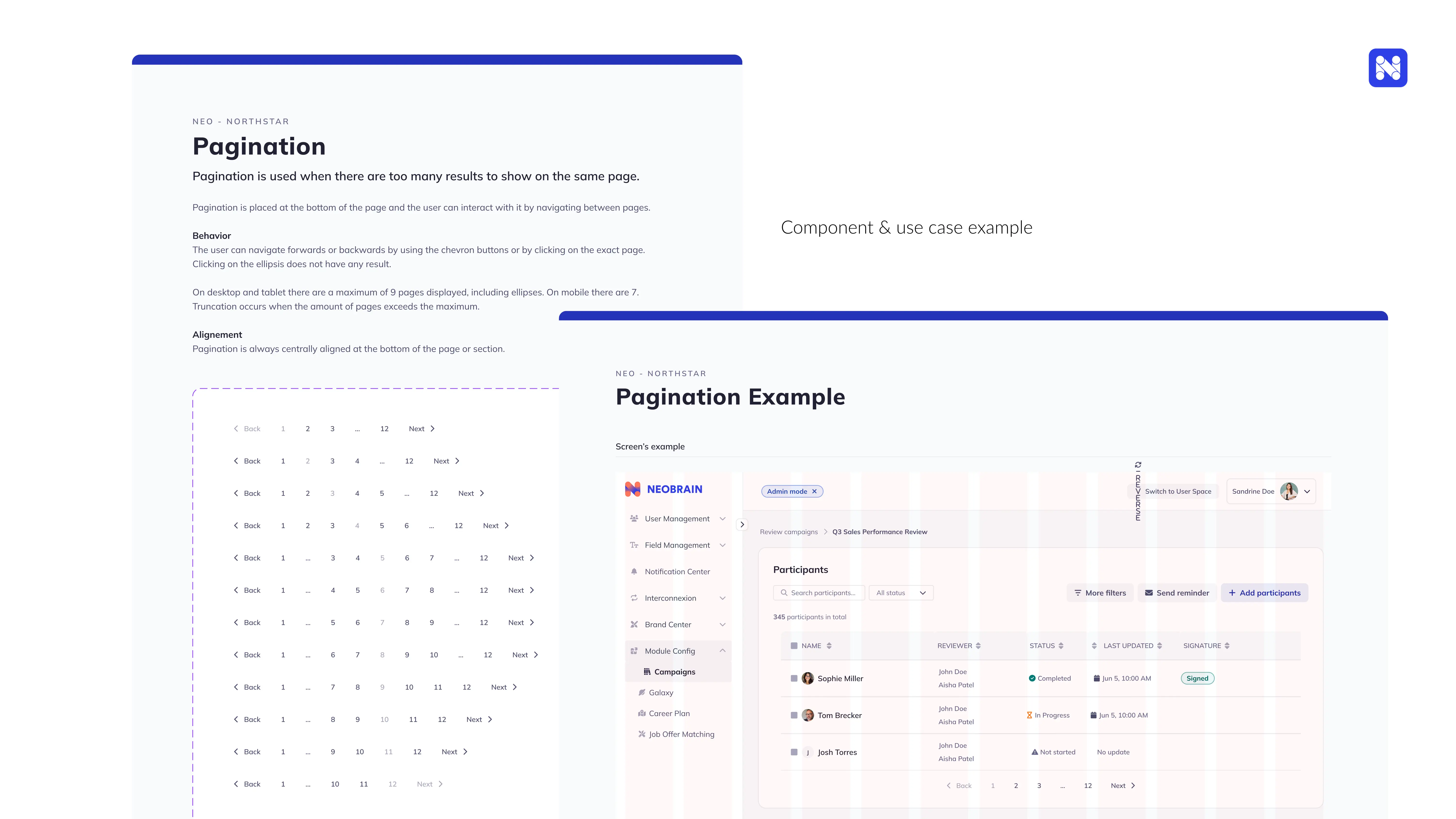
The audit revealed hardcoded colours and spacing โ€” no token logic. Patching would have inherited that debt. A token-first rebuild meant any future global change (rebrand, dark mode) propagates in one update instead of hundreds.

2. Embedding the frontend engineer from day one

2. Embedding the frontend engineer from day one

Building in isolation risks components that can't be implemented as designed. By co-building with the frontend engineer, Figma variant logic mirrored Storybook props from the start โ€” no reconciliation phase, no divergence at launch.

3. Embedding accessibility at component level, not as a post-build layer

3. Embedding accessibility at component level, not as a post-build layer

Retrofitting WCAG AA after the fact breaks implementations. Defining contrast ratios, focus states, and keyboard navigation in every component spec meant accessibility was inherited automatically by every product screen โ€” no per-feature QA needed.

05 - RESULTS

Neo Design System Wins

Neo Design System Wins

DEV INTEGRATION & QA EFFICIENCY

DEV INTEGRATION & QA EFFICIENCY

Divided by 2

Divided by 2

Engineers reported a clear reduction in time spent building UI from scratch โ€” Storybook components were ready to use & Visual inconsistencies between design and implementation dropped markedly

ACCESSIBILITY

ACCESSIBILITY

AA

AA

WCAG AA compliance embedded at component level โ€” inherited automatically by every product screen using the system

The bottom half of a screen of a mobile device
A mockup of screenshot for an app